No products in the cart.
Design
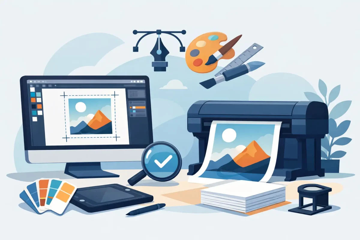
How to Prepare Print Artwork Properly
21
Apr
Apr
Good artwork does not just look right on screen. It has to print cleanly, trim accurately and hold together across the material, finish and size you have ordered. That is why knowing how to prepare print artwork properly can save time, avoid delays and prevent costly reprints.
If you are ordering business cards, menus, loyalty cards, certificates, flyers or branded retail print, the same principle applies. Your file needs to be built for production, not just presentation. A polished design with the wrong settings can still fail at print stage, while a straightforward layout set up correctly will usually move through faster and produce a better result.
How to prepare print artwork from the start
The easiest way to avoid artwork issues is to build the file to the finished product size from the beginning. That means setting the correct dimensions, adding bleed where needed and keeping all critical text and logos away from the trim edge. If you design first and try to force everything into a print-ready format later, problems tend to appear.
Bleed is one of the most common points missed by customers. In simple terms, bleed is the extra image area that extends beyond the final trim size. It gives a margin for trimming movement so you do not end up with thin white edges. For most commercial print, 3mm bleed on each side is standard, though some products may vary. If your background colour, image or pattern runs to the edge, it must continue into the bleed area.
Safe area matters just as much. Even with accurate finishing, trimming can move slightly. Keep text, numbers, logos and other important elements at least 3mm inside the trim edge, and often more on smaller items such as plastic cards or business cards. That small gap can make the difference between a neat final piece and one that looks cramped.
Set up colour for print, not for screen
One of the biggest gaps between digital design and commercial print is colour mode. Screens display RGB, while printed work is generally produced in CMYK. If you send RGB artwork, colours may shift when converted for press. Bright blues, greens and fluorescent-looking tones are especially prone to change.
When preparing artwork for print, set your file to CMYK as early as possible. This gives you a more realistic view of how colours are likely to reproduce. It does not guarantee a perfect screen match, because paper stock, laminate, foil, lighting and press conditions all influence the final result, but it reduces surprises.
Black needs care too. For body text and fine details, use solid black only, rather than a mixed rich black. Small type built from four colour values can print slightly out of register and look fuzzy. Rich black has its place for large solid areas, but not for small text or linework.
If your brand relies on a very specific shade, it is worth checking whether a close CMYK match is acceptable for the product you are ordering. Some premium applications and specialist print processes may need a different approach, especially where finish and surface affect perceived colour.
Image quality and file resolution
Artwork that looks sharp on screen can still print poorly if the image resolution is too low. As a working rule, most print files should use images at 300dpi at the final printed size. If you enlarge a small web image to fill an A5 flyer or poster, it will usually lose clarity and show pixelation.
This matters even more on products that people handle closely, such as menus, cards, labels and invitations. Fine details, skin tones, textures and product photography all need enough resolution to reproduce cleanly. For large-format items viewed from a distance, such as some banners or posters, lower effective resolution can sometimes be acceptable. It depends on viewing distance and substrate, so there is no one-size-fits-all rule.
Avoid screenshots where proper artwork files exist. A logo copied from a website is rarely suitable for print. Vector files are best for logos, icons and line-based graphics because they can scale without losing sharpness. If you only have bitmap artwork, make sure it is supplied at the correct size and quality.
Fonts, lines and layout details
Fonts cause more production issues than many customers expect. If a printer does not have the exact font used in your artwork and the file is not packaged correctly, the text can substitute or reflow. The safest option is usually to supply a print-ready PDF with fonts embedded. In some cases, converting text to outlines may also be appropriate, though that removes editability.
Small text should be used carefully, especially when reversed out of a dark background or printed across multiple process colours. Fine serif type, pale grey lettering and very thin lines may look elegant on screen but can be harder to reproduce consistently, particularly on textured stocks or smaller formats.
Keep line weights practical. Hairlines that appear visible in design software may disappear or break up at print stage. If you are using borders near the edge of a design, allow for normal trimming tolerance. Very thin borders can appear uneven after finishing, even when the job has been cut correctly within standard tolerance.
Prepare the right file format
For most commercial print jobs, a high-quality PDF is the safest and most efficient format. It keeps layout, fonts and image placement more stable than editable working files. Where possible, export using print-quality settings and include bleed and crop marks only if requested.
Native files from Adobe Illustrator, InDesign or Photoshop can be useful in some workflows, but they also create more room for missing links, unsupported effects and font issues. If you are sending working files, package them properly with linked images and font data where licensing allows.
Flatten transparency if your workflow requires it, and check overprint settings before export. These technical points are easy to miss and can affect how elements appear once processed for press. If your design includes foil, white ink, scratch-off panels or other specialist finishes, those features usually need their own clearly defined artwork layers or spot references. Standard artwork rules still apply, but specialist embellishments often bring extra setup requirements.
Check the artwork against the product you ordered
A flyer, folded menu, plastic loyalty card and certificate of authenticity may all be branded consistently, but they should not be built the same way. The product format changes how the file needs to be prepared.
For folded items, allow for panels, creases and read order. For laminated cards, make sure signatures or variable data are positioned where they will function properly. For booklets, page count and pagination need to be set correctly. For labels, consider shape, cutter alignment and how the design sits on the final pack. For NCR forms, write-through usability matters as much as branding.
This is where generic artwork habits can fall short. A design that works well for digital use may need adjustment for a physical format, especially when handling, durability and finishing are part of the job. If you are ordering across several product types, consistency matters, but so does suitability.
A practical pre-flight check before you send artwork
Before uploading or submitting your file, take a few minutes to review it as if it were already on press. Check the final size, bleed, safe area, image resolution, colour mode and spelling. Make sure version control is clear if more than one file exists. It sounds basic, but many delays come from customers sending the wrong revision.
Zoom in closely on logos, text and edges. Then zoom out and check the overall balance. Confirm that nothing important sits too near the trim, fold or drill area. If the product includes a premium finish, check the relevant artwork elements are separated and labelled clearly.
Naming files properly also helps production move faster. A file called Final-Artwork-Use-This-One can still cause confusion if three similar files arrive with it. Use names that identify the product, size and version plainly.
When it is worth asking for help
Not every job needs a designer, but not every file should be sent unchecked either. If your artwork includes variable data, specialist finishes, unusual sizing or a product you have not ordered before, a quick review can save a lot of back and forth. That is particularly true for commercial runs where one setup issue can affect hundreds or thousands of printed pieces.
Pressola works with both standard business print and more specialised formats, so artwork expectations can vary by product. A simple leaflet may be straightforward, while a hot foil card, scratch card or branded certificate needs tighter setup. The key is to treat artwork preparation as part of production, not as an afterthought once the design looks finished.
Print rewards accuracy. A well-prepared file gives you a better chance of getting the result you expected, on the stock and finish you chose, without unnecessary delays. If you build with print in mind from the start, the whole job tends to run better.