No products in the cart.
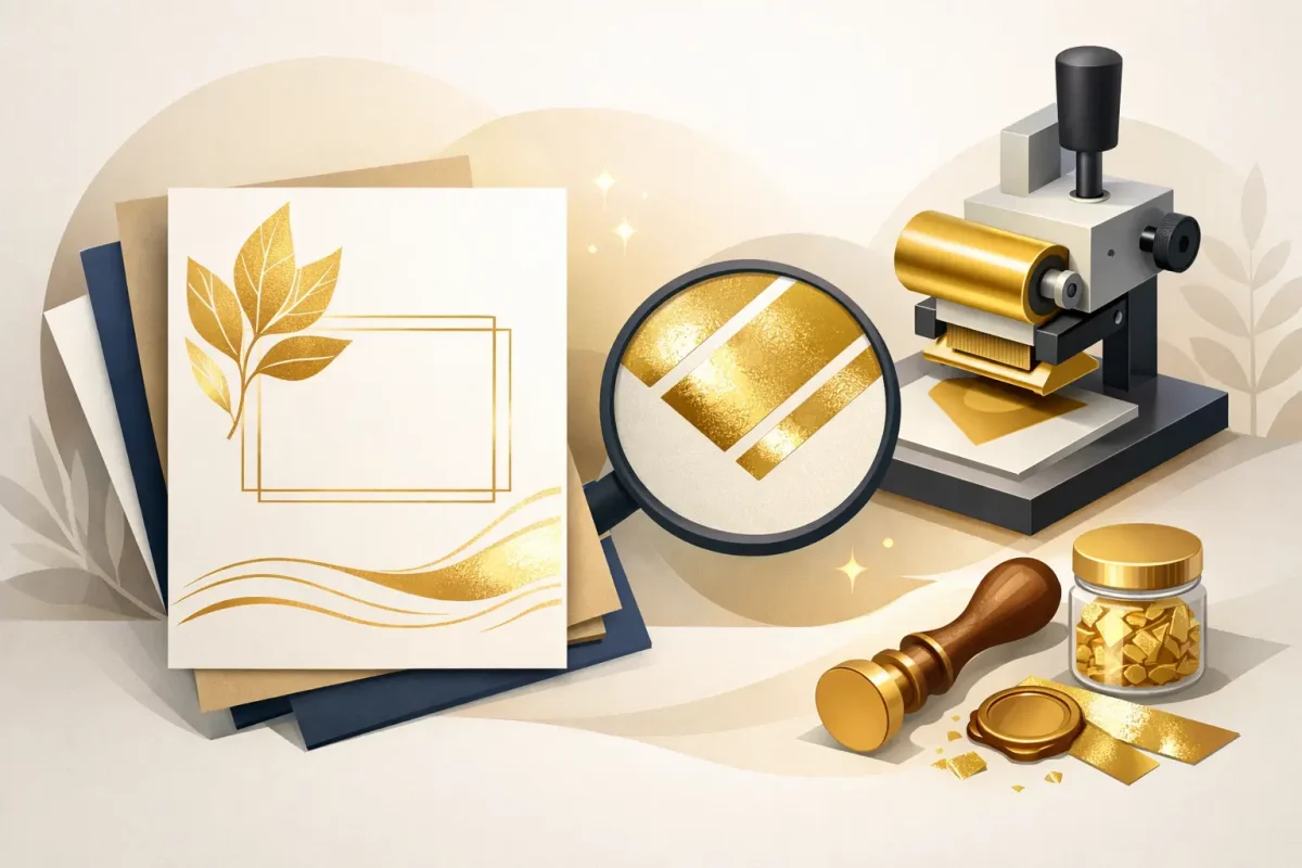
Hot Foil Printing
Gold Foil Invitation Printing That Sells
06
Apr
Apr
A standard invitation can do the job. Gold foil invitation printing does more than that – it sets expectations before the event even starts. For businesses, venues and organisers, that matters. The invite is often the first physical touchpoint someone sees, and if it feels considered, polished and premium, the brand behind it does too.
That is why foil remains a strong choice across hospitality, retail events, beauty launches, private functions and formal occasions. It is not simply decorative. Used properly, it helps direct attention, adds perceived value and gives printed invitations a finish that standard ink cannot replicate.
Why gold foil invitation printing still stands out
Gold foil works because it reflects light rather than absorbs it. That simple difference changes how typography, borders, logos and small details are noticed in the hand. On a well-chosen stock, even a restrained amount of foil can make an invitation feel more expensive and more intentional.
For commercial buyers, there is also a practical benefit. Premium print helps support premium pricing. If you are hosting a ticketed launch, promoting an exclusive event or inviting VIP guests to a venue opening, the printed piece should match the offer. A flat, low-spec invitation can undermine that. Gold foil gives you a way to lift presentation without overcomplicating the design.
It is also versatile. Traditional scripts and formal layouts suit gold foil, but so do modern branding systems with clean type, simple logos and minimal layouts. The finish itself is classic. The design around it can go in several directions.
When gold foil invitation printing makes commercial sense
Not every invitation needs foil. If you are mailing very high volumes for a short-life promotion, standard digital print may be the better fit on cost and speed. But there are plenty of situations where foil earns its place.
Launch events are a good example. A salon opening, hotel relaunch, boutique preview evening or product introduction often has a guest list that is selective rather than mass-market. In those cases, the invitation is part of the experience. Foil helps create that sense of occasion.
The same applies to wedding stationery, anniversary events, awards nights and formal dinners. Guests tend to keep these invitations for longer, which means the quality of print matters more. If the piece is likely to be displayed on a mantelpiece, pinned to a board or photographed, the finish is doing useful work.
Foil can also help when brand perception is central. Estate agents, jewellery retailers, premium clinics, hospitality venues and beauty businesses often need print that feels refined without being overstated. Gold foil on invitations, vouchers or event cards can support that positioning well.
Paper stock matters as much as the foil
One of the most common mistakes with gold foil invitation printing is focusing on the metallic finish and overlooking the board underneath. Foil is only as effective as the stock it sits on.
Heavier stocks generally feel more substantial, which suits invitation printing. A rigid card gives the foil a better platform and improves the perceived quality as soon as the recipient picks it up. Smooth uncoated boards are often a reliable choice because they allow the foil detail to remain crisp while keeping the overall look refined.
Texture needs a bit more thought. A lightly textured stock can look excellent and add character, especially for weddings or heritage-style branding. But deeper textures can interrupt very fine foil details. If your design includes small serif type, thin lines or delicate monograms, a smoother surface usually gives cleaner results.
Colour is another factor. Cream, white, black and deep navy are popular partners for gold foil because they create strong contrast. The right choice depends on the tone you want. White and cream feel formal and classic. Black with gold can look sharp and high-end. Dark green, burgundy or navy can work well for seasonal events, hospitality invites or luxury retail.
Designing for foil without overloading the page
Foil works best when it has room to breathe. If every element is metallic, the effect quickly becomes heavy and harder to read. The strongest invitation layouts usually use foil selectively – a name, logo, headline, border or key motif – while the supporting details are printed in ink.
This matters for both aesthetics and function. Event details such as times, addresses, booking references and RSVP information need to be readable first. Foil is excellent for emphasis, but not always ideal for large amounts of body text. Under certain lighting, highly reflective areas can be slightly harder to scan than standard print.
A balanced layout tends to perform better. Use foil for the details you want guests to notice immediately, then let conventional print handle the practical information. That gives you the premium finish without sacrificing clarity.
Artwork setup is also important. Foil requires precision. Thin strokes, tiny reversed-out details and complex textures may not reproduce as cleanly as they appear on screen. A simpler shape with confident line weight will usually give a better finished result. If you are preparing artwork for production, it helps to treat the foil layer as its own element rather than just another colour choice.
Gold foil invitation printing and the production trade-offs
There is no point pretending foil suits every brief equally. It depends on quantity, timescale, mailing method and budget.
Foil printing is a specialist finish, so it generally costs more than standard print alone. That does not make it expensive in the wrong context, but it does mean the value should be clear. If the invitation supports a premium event, a high-spend guest journey or a major brand touchpoint, the additional spend is usually justified. If the piece is purely functional and disposable, it may not be.
Lead times can also differ from straightforward digital jobs. Foil processes require planning, especially on bespoke work or larger quantities. If your event date is fixed, leave enough time for artwork approval, production and delivery. Last-minute jobs reduce flexibility and can limit your paper and finish options.
There is also the question of postage and handling. Heavier invitation stocks and layered finishes create a stronger first impression, but they may affect mailing costs or packaging choices. That is worth factoring in early if you are sending invitations at scale.
Where foil sits within a wider invitation set
An invitation rarely stands alone. For many buyers, it is part of a larger printed set that could include RSVP cards, envelopes, belly bands, event menus, place cards, table plans, signage or thank-you cards. Consistency across these pieces is where the premium effect really builds.
Gold foil does not need to appear on every item. In fact, restraint often works better. You might use foil on the main invitation and envelope detail, then carry the same typography and colour palette into the remaining pieces with standard print. That keeps the set cohesive and practical on budget.
For venues, hotels and event organisers, this joined-up approach is especially useful. Matching the invitation to on-site print materials creates a smoother guest experience. It also avoids the common problem of the invite looking premium while the rest of the event stationery feels disconnected.
This is where working with a supplier that covers both specialist finishes and standard event print can save time. At Pressola, that means buyers can source invitations alongside menus, signage, cards and presentation print from one place rather than splitting the job across multiple providers.
Choosing the right finish for your audience
Gold foil is not one-size-fits-all. A soft gold on a warm white board gives a different result from a bright metallic gold on black stock. One feels understated and formal. The other feels bold and high contrast. Neither is automatically better.
Think about who is receiving the invitation and what response you want. If the audience is corporate, clean layouts with restrained foil often feel more credible. If the event is celebratory or fashion-led, you may have more room for stronger visual contrast. If the invitation is for a wedding or private event, tone and personal style will shape the design more heavily.
The safest choice is usually the one that aligns with the wider brand or event identity. Gold foil should support the message, not compete with it.
Getting better results from the start
The best foil-printed invitations usually come from clear decisions made early. Define the purpose of the piece, the quantity you need, how it will be delivered and which details genuinely need emphasis. That helps narrow the stock, format and finish before artwork goes too far down the wrong path.
If you are ordering for a business or event programme, samples are useful because foil is a tactile finish. What looks subtle on screen may feel underwhelming in hand, and what appears bold digitally may be just right once printed. Seeing stocks and finishes in person can prevent expensive second guesses.
A good invitation does not need excessive decoration. It needs the right hierarchy, the right stock and a finish that supports the message. Gold foil is effective because it adds distinction quickly. Used with restraint and produced properly, it gives invitations the kind of presence people notice straight away.
If you want recipients to feel that your event is worth showing up for, the invitation should make that case before the envelope is even opened.